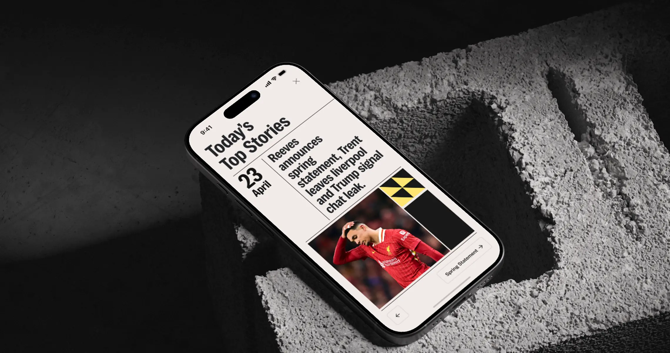
A scalable redesign of a national news platform, strengthening editorial clarity, trust signals, and mobile readability — while establishing a reusable design foundation to support engagement and subscription growth.
ProblemAgeing digital experience slowing reader engagement and subscription conversion
Impact+14.6% page views per session · +10.4% articles read per visit · –24.2% development time
Overview
The Challenge
The iPaper (known previously as iNews / The i) needed a strategic rebrand and digital redesign to reflect its editorial evolution and strengthen its position as a trusted, impartial news source. The i Paper needed a coherent digital foundation that could increase reader engagement, improve retention, and support long-term subscription growth.
The digital experience was showing its age:
●
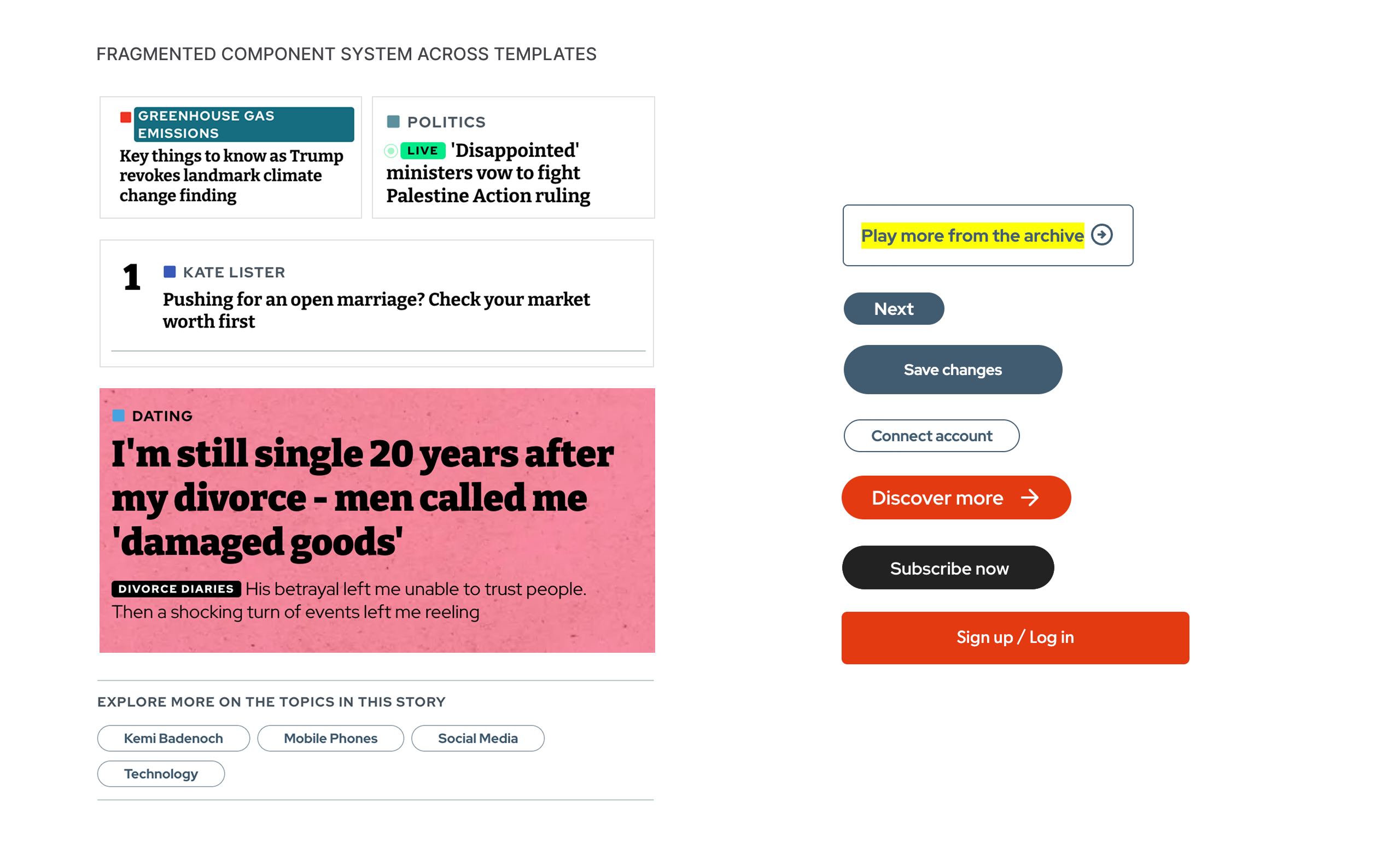
Disjointed UI and inconsistent patterns across pages.
●
Weak content discoverability (especially on mobile).
●
Editorial workflows that didn’t scale.
●
Accessibility and readability issues affecting satisfaction and reach.
The goal was clear: Unify the brand experience, reinforce trust, and redesign key digital pages to support deeper reader engagement and confidence.
Scroll · Drag to pan
Scroll · Drag to pan
Discovery
What I did
I led the UX and visual direction across key editorial touchpoints, bridging strategy and execution across editorial, product, engineering, and analytics. I created 5 reader scenarios based on real behaviours and prioritised 2 key journeys to design around; ensuring we supported different reading modes (quick scan → deep read).
Redesigning the entry points
Homepage structure + navigation requirements
Article page layout and hierarchy
Shorts positioning (to feel editorial, not social)
Perspectives interaction patterns
Refining through research
Using qualitative + quantitative feedback, we validated what readers were telling us clearly:
Large modules interrupting scroll were frustrating
Readers wanted faster access to “go-to” topics
INSIGHTS
Reader validation
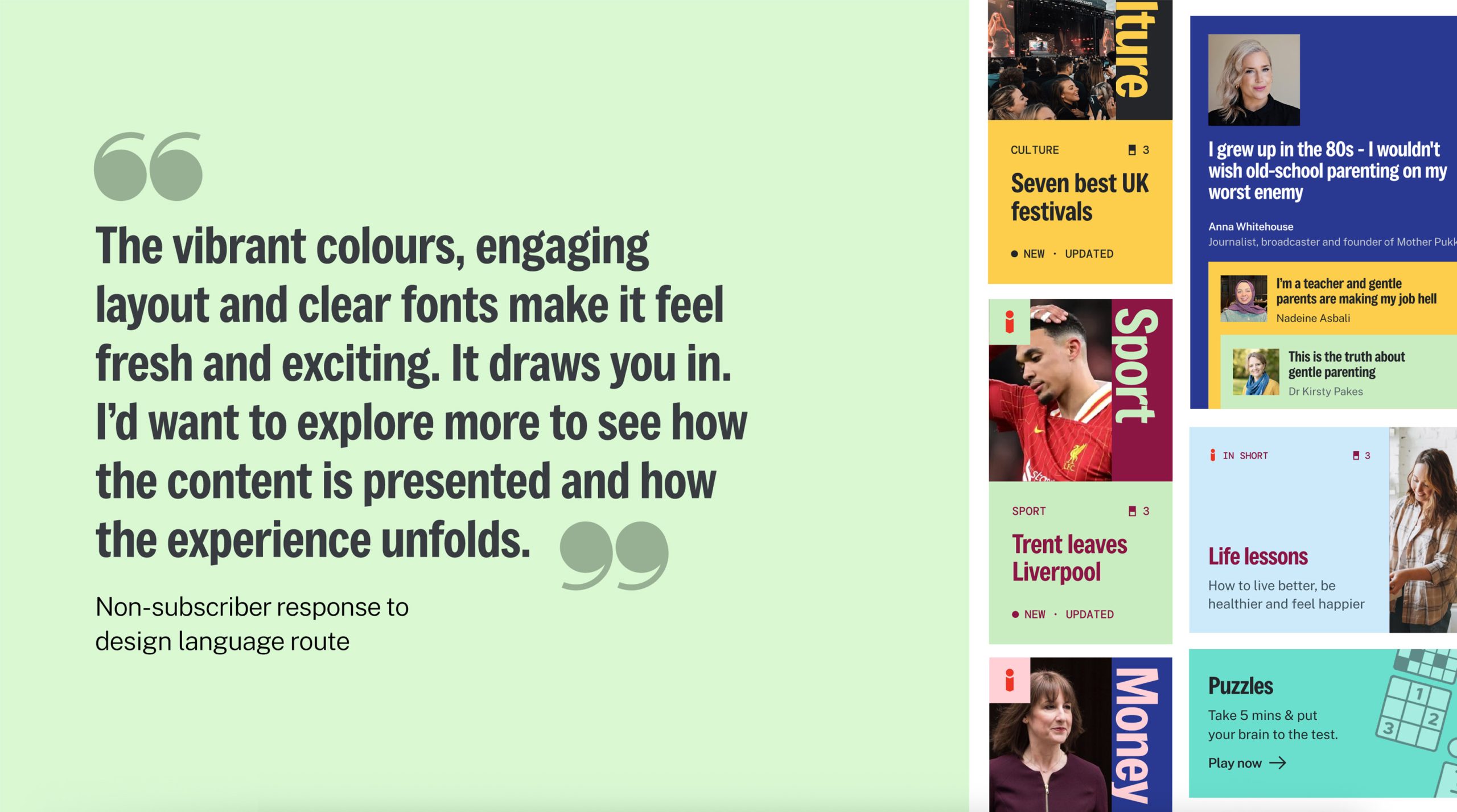
I tested early design directions with readers to validate what felt premium, trustworthy, and worth exploring.Feedback confirmed that stronger hierarchy, clear typography, and confident use of colour increased curiosity and willingness to engage.
SYSTEM
Translating the rebrand into digital
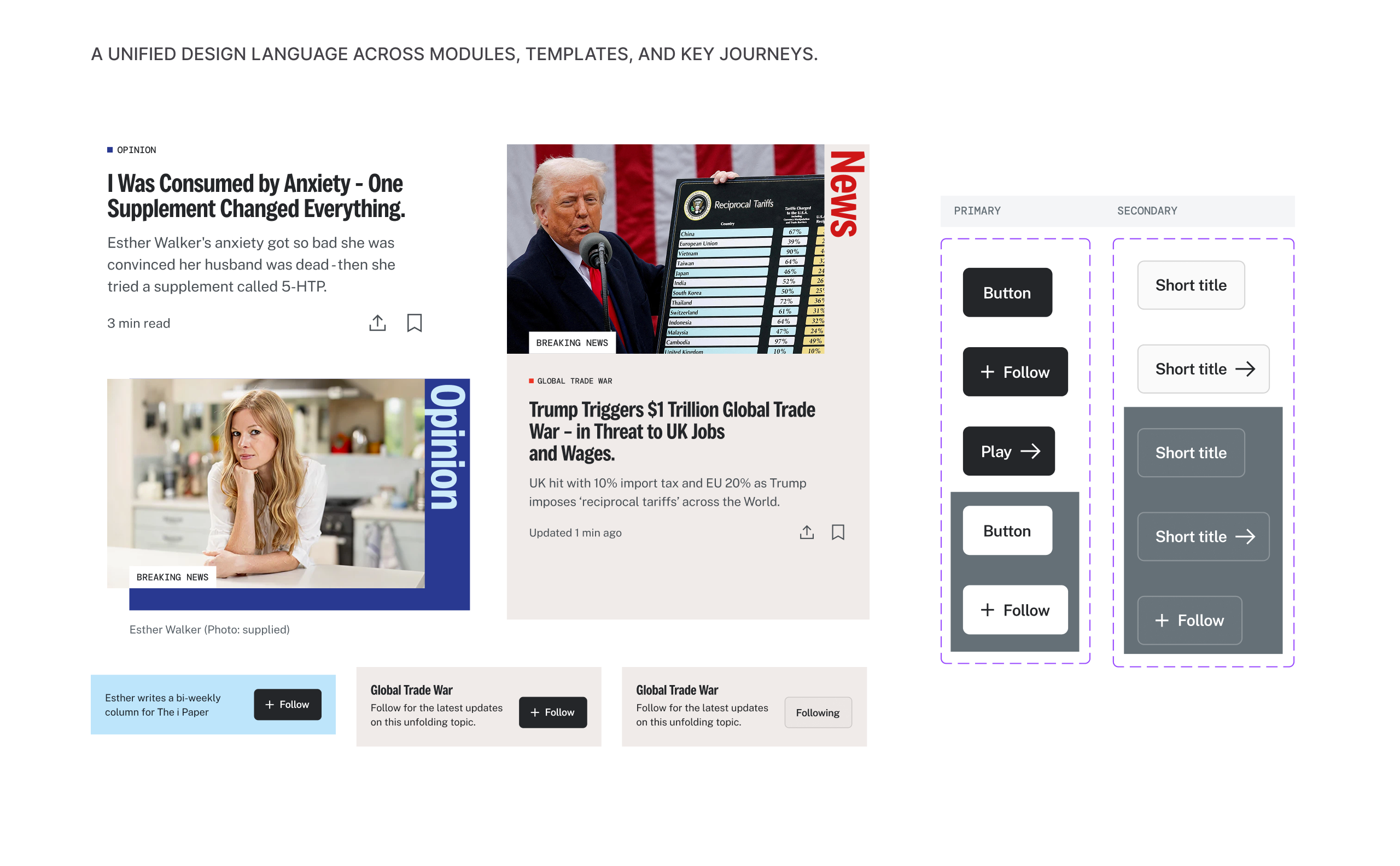
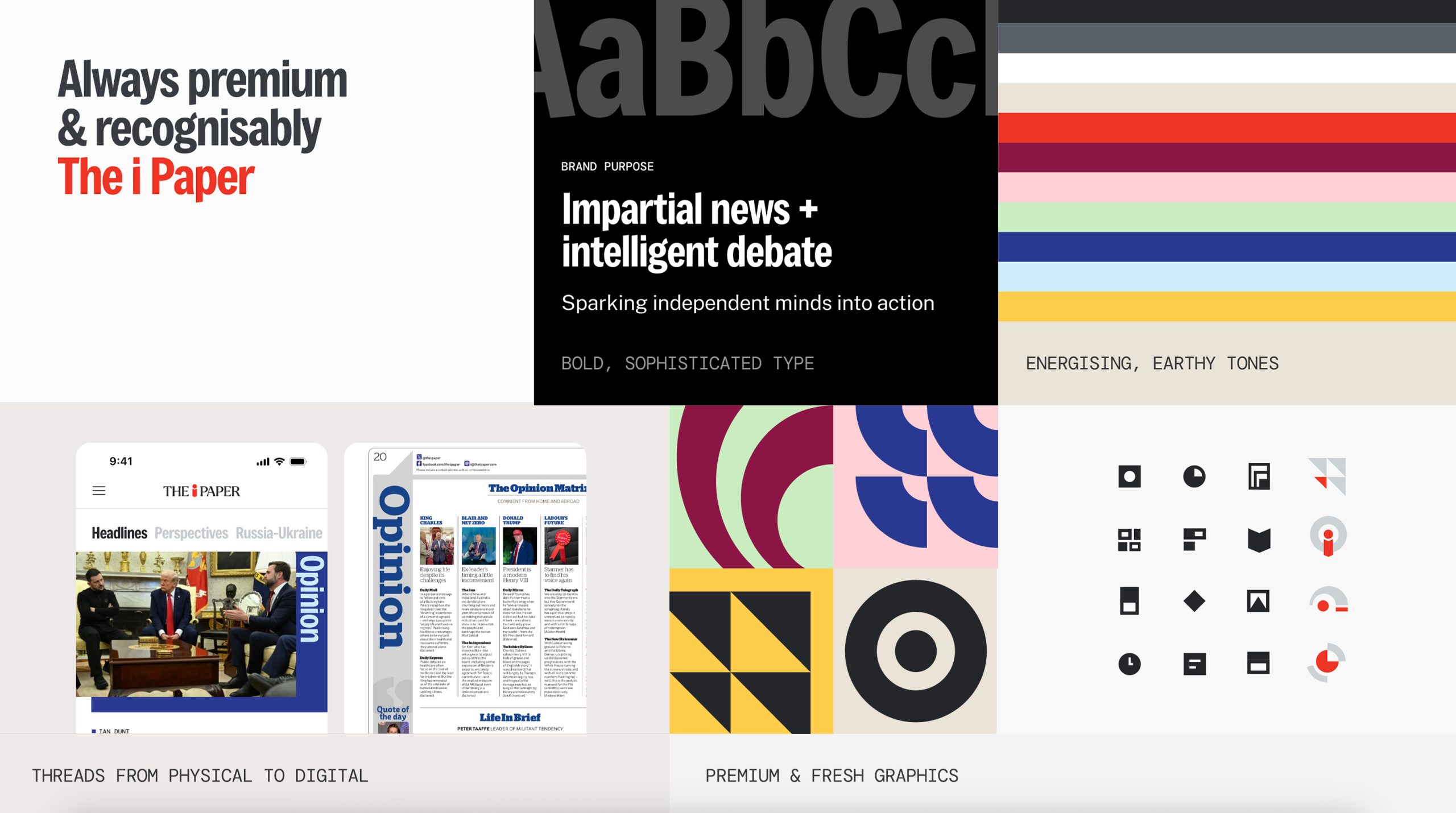
I translated the print-led rebrand into a coherent digital language — aligning typography, colour, iconography, and editorial layout rules. This ensured the experience felt recognisably The i Paper across every touchpoint and device.
SCALE
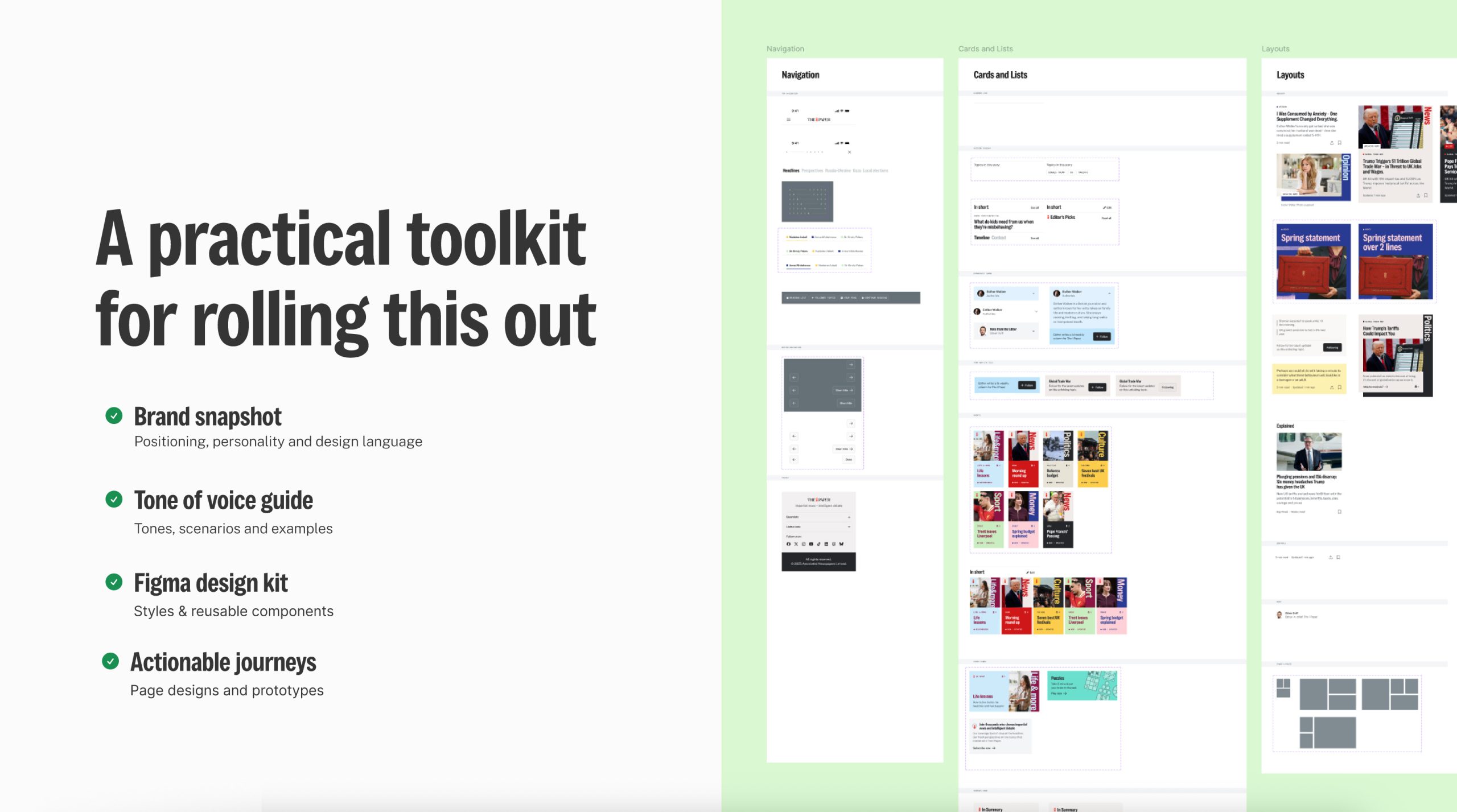
A practical rollout toolkit
I created a practical toolkit to roll out the new experience at scale: brand snapshots, tone-of-voice guidance, reusable Figma components, and actionable journeys. This made the system easier to adopt, faster to iterate, and consistent across teams.
PROTOTYPE
Flow Testing
Wireframe prototypes helped us test mobile journeys quickly — validating structure, navigation, and reading modes before committing to UI.
Implementation
Mobile Experience
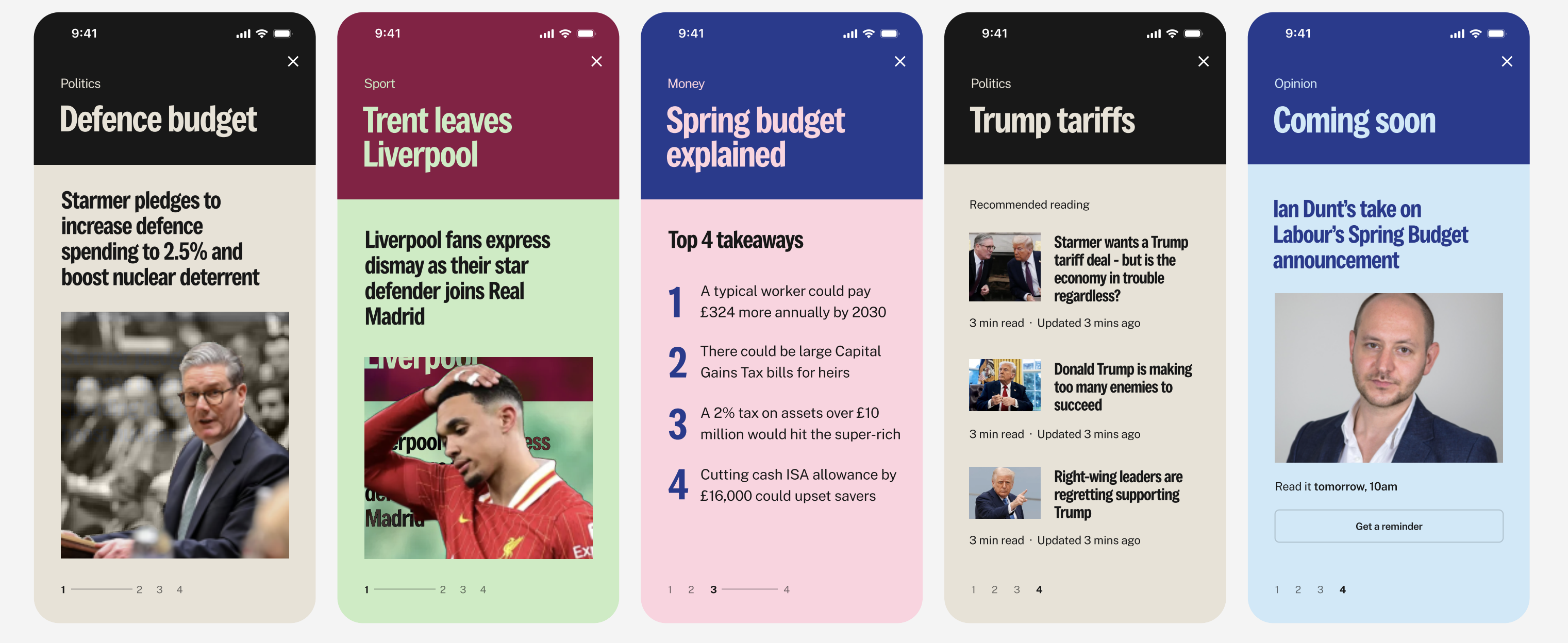
Once the flows were validated, I designed the mobile experience in high fidelity; focusing on readability, trust signals, and a seamless journey across key editorial templates.
Digital Product
Unified Experience
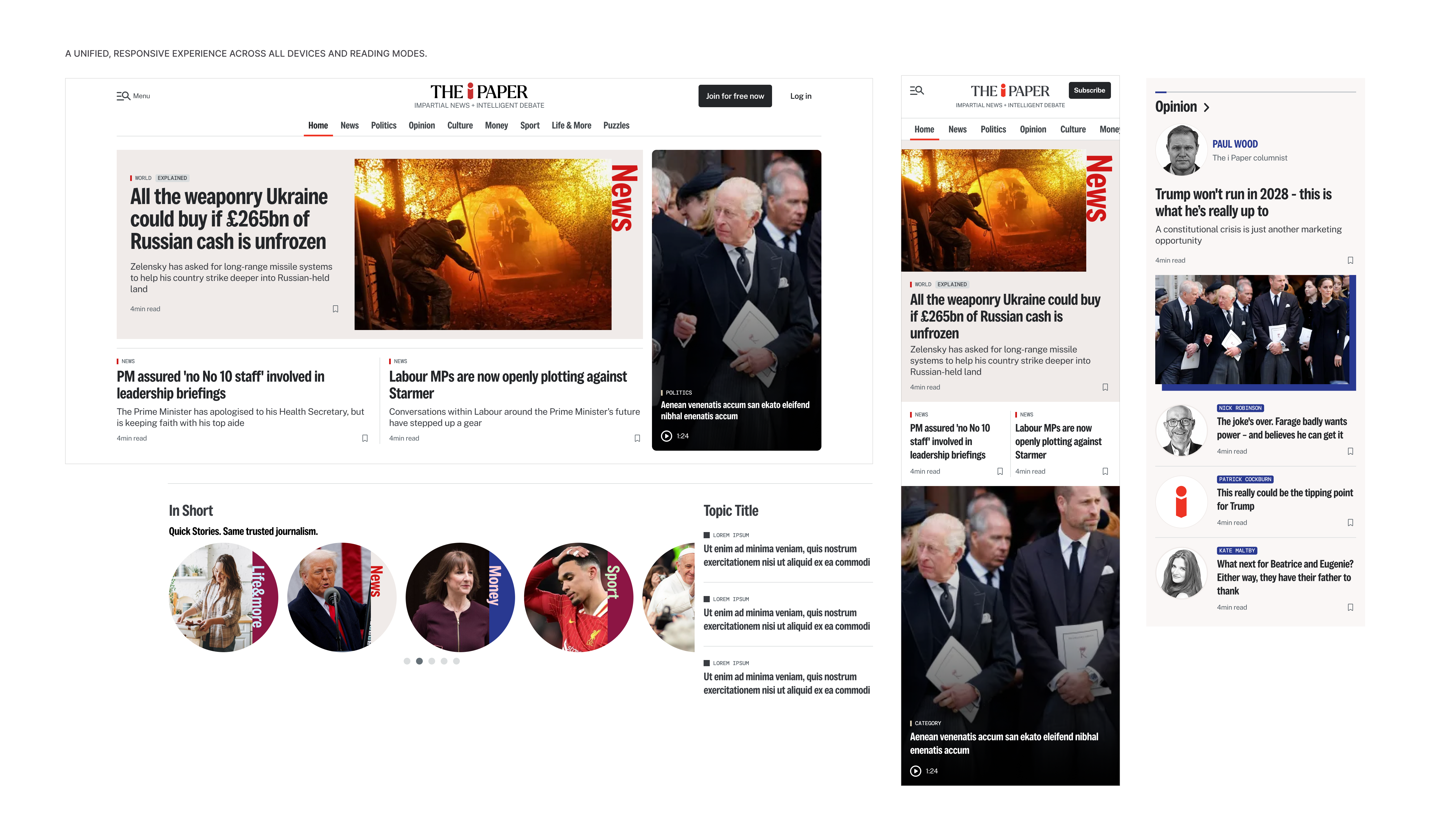
To modernise the i Paper’s digital presence, I designed a connected experience across desktop and mobile, ensuring consistent navigation, editorial hierarchy, and trust signals across templates. This responsive system became the baseline for future rollout — and the starting point for the native app experience.
Scroll or pinch to zoom · Drag to pan
Results
Engagement + efficiency
●+14.6% increase in page views per session
●+10.4% uplift in articles read per visit
●–24.2% reduction in development time for future updates
●
Stronger trust signals and a more “editorial” feel — especially in Shorts
This project was more than a redesign. It established a scalable digital foundation designed to grow engagement, increase visit value, and support subscription revenue while also improving how cross-functional teams worked together.